
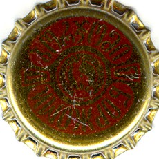
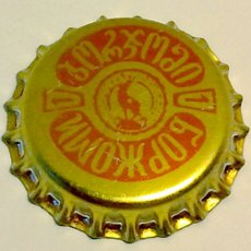
Continuing the discussion of the quality of pictures in the catalog, I would like to share my experience with you. Often scanners do not provide satisfactory images, usually because of the way the cap is painted. As a result, we get a dark – or even black – picture. There are many such images in the catalog, and eventually we will have to replace them. Although I’m not skilled photographer, I thought I would play with light and a white screen. The result? As you see, a sufficiently good picture.
Well, how did I do that? I put a sheet of paper on the table and set another one vertically. Then I placed a cap near where the two sheets met. The flash went off (see direction of arrow). The set-up did the rest!
Our main goal should be to make the text that is printed on the cap absolutely readable, or, if there is no text, to make the illustration on the cap easy to understand. With this system we achieve that by letting the vertical sheet reflect light down on the face of the cap. This way, even an ordinary photographer like me can produce sufficiently effective pictures for the catalog!
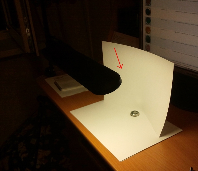
Certainly, it’s better make shots with more careful preparations, with good camera, light and screens. It's up to you, good luck!
Comments
Если фотографировать нечего, то есть есть только готовый файл, то можно поступить так. В 99% случаев цветовое пространство будет RGB, поэтому не буду писать как действовать с CMYK. Открываем картинку в фотошопе. Жмём горячие клавиши ctrl-M, или выбираем Image/Adjustments/Curves. Видим диагональную линию, которую хватаем где-нибудь посередине и тянем перпендикулярно вверх и влево, чтобы получалась дуга. Смотрим на результат. При некотором количестве попыток можно добиться интуитивных действий - куда и на сколько нужно вытягивать дугу. Действует в большинстве случаев, но не панацея.
Да уж, не панацея это точно. Я с этой дугой не работал, обычно делаю через "Уровни". В принципе то же самое на выходе получается... Если я правильно понимаю, подстройка уровней берет только часть информации из исходного материала корректируя цвета. В любом случае картинка получается беднее чем изначально снятая качественно, для которой такая глубокая коррекция не требуется.